CALENDAR of activities @work 2023

DESCRIPTION

A calendar design which was made to showcase the fun activities throughout the year. Each month got printed on A3 format and pinned on the wall in the eating area. A particular detail I have added is the addition of a unique color for each month, of which you can find the color code within the design as well.


Software Used

Adobe Illustrator

EURONORTH CLEAN-UP DAY! - ICON DESIGN

EuronorthClean-upDay_GradientShadowDrop_Sparkle.jpg

WATER FOR LIFE

Dassault Systèmes wants to address the challenge, and offers, through Virtual worlds, tremendous accelerators for measuring and optimizing the water footprint of businesses, supporting the growth of sustainability-focused innovation and empowering future generations.

DESCRIPTION

Inspired by the “Water for life” video, I was asked to design an icon for one of the EURONORTH volunteering days of 2021: “World Clean-up Day!, September 17th”. This was an initiative proposed to +1500 people around 9 countries and 20 offices to give back to our local communities and embrace 3DS commitment to sustainability. The icon was mainly used in EURONORTH communications.

A beautiful initiative to design an icon for, but also to take action: at the Vilvoorde office, we cleaned the surroundings of a nearby river on that same day (group picture below). The official World Clean-Up Day was one day later.

GroupPicture_3DSBELGIUM.jpg


Breakdown

01 HORIZONTAL DESIGN - THUMBNAILS

First, I started by creating some thumbnails based on the initial brief I got from the EURONORTH team. I usually take inspiration from existing designs to then think more out of the box and come up with some crazy designs. For example, here I started with some simple wave and droplet shapes and ended up with the globe being cleaned by a crab.

02 VERTICAL DESIGN - DIGITAL DESIGN AND ITERATION

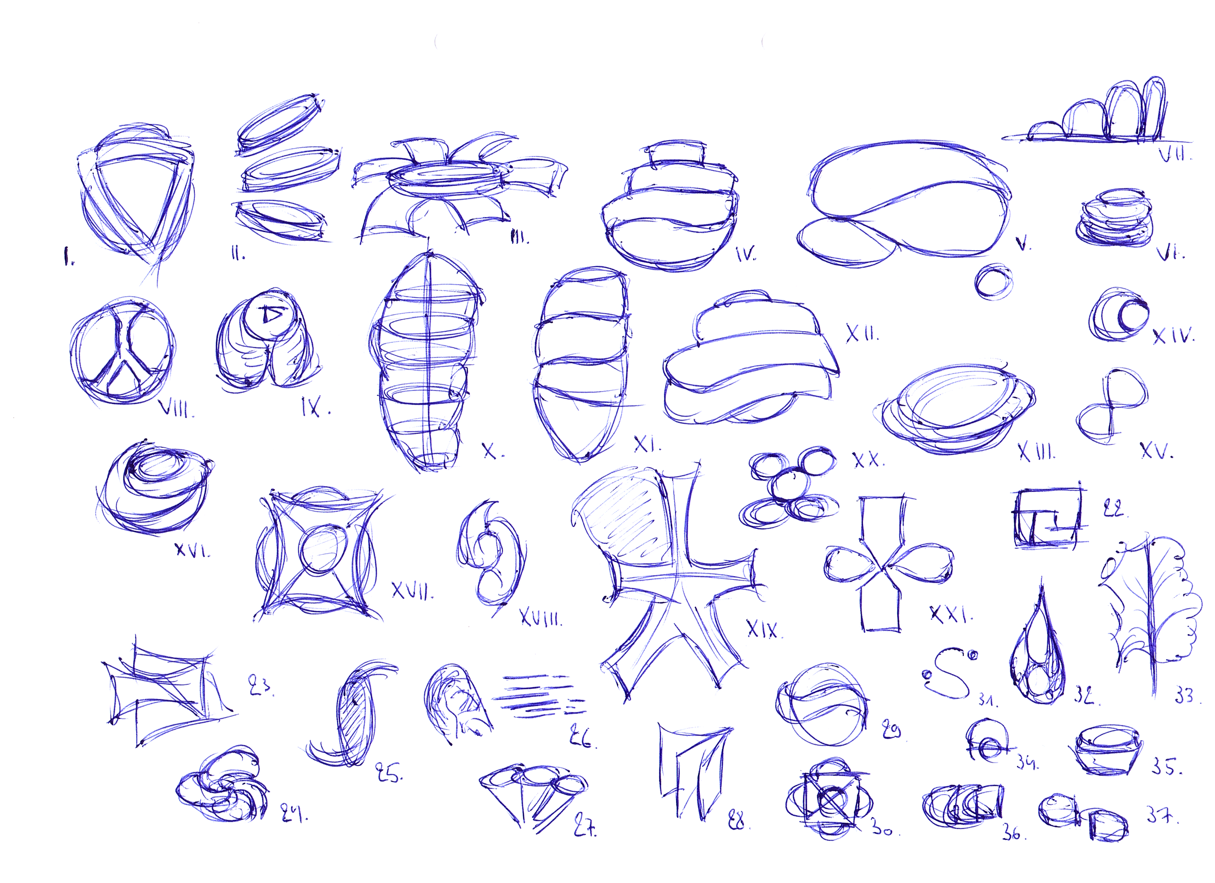
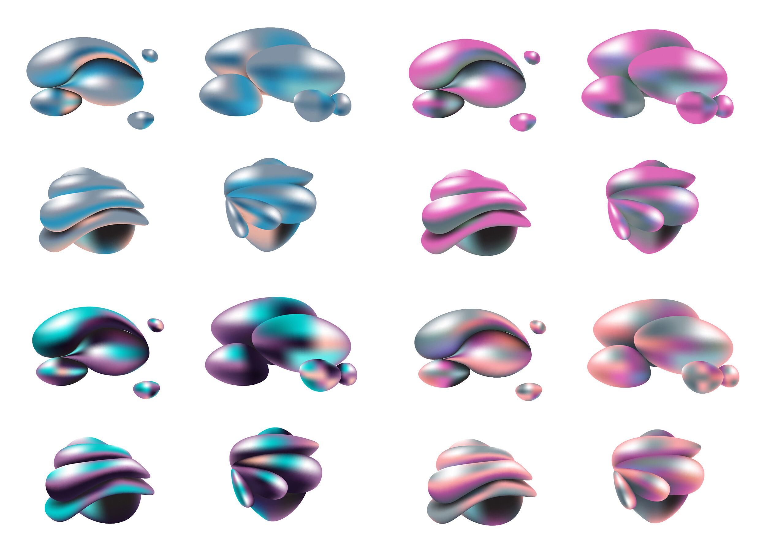
Next, I designed two selected thumbnails digitally. This selection was made together with the team during one of the presentations I hosted. I really enjoy taking the time to present and discuss each step of the way with the (internal) client. Although it is a longer approach then simply “design and deliver”, it usually outputs a design which has a way richer background story. So, I think it is very important to include the client during the whole process, to regularly update on the latest status and more importantly to steer them in the right direction.

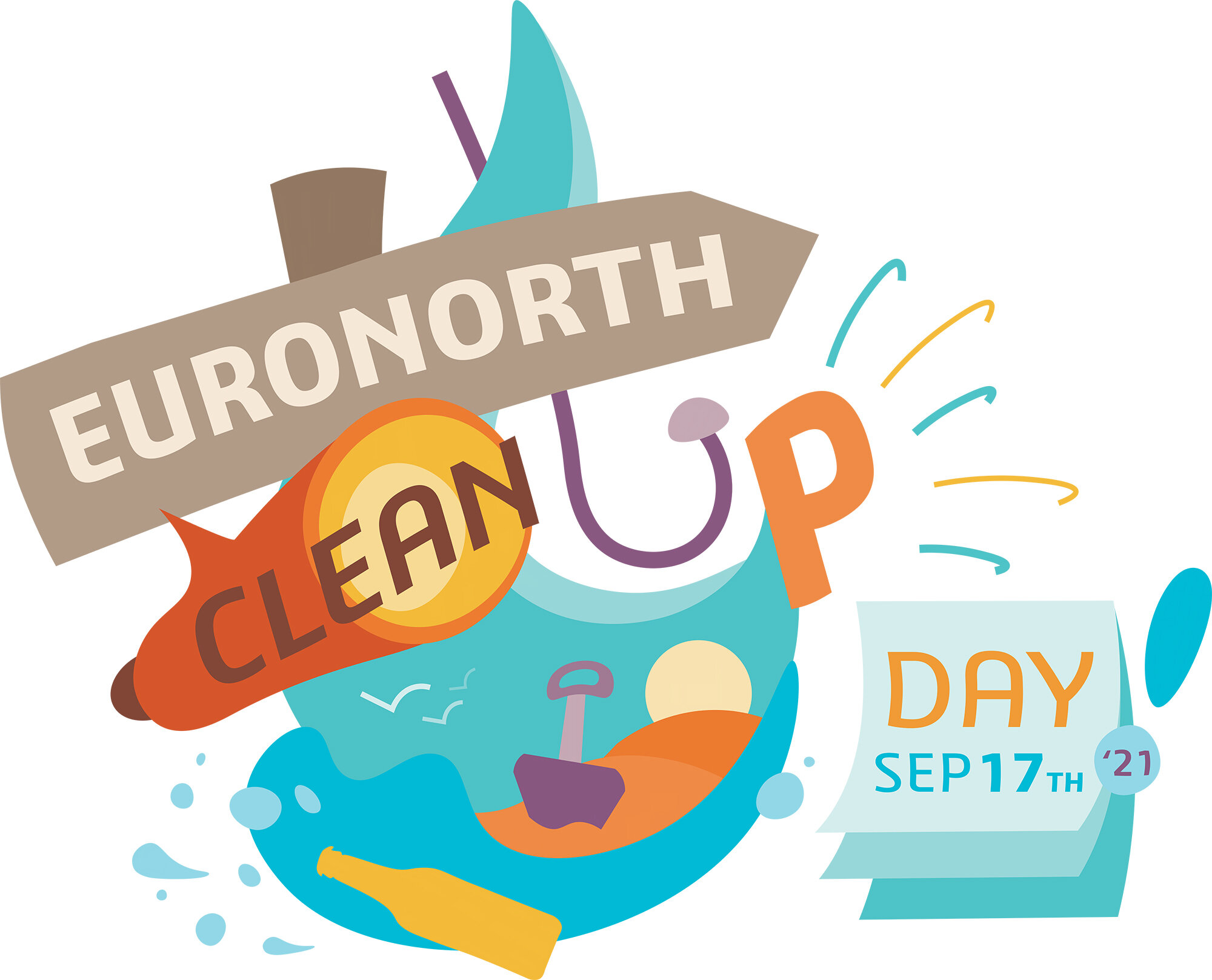
The team quite liked both designs and wanted an iteration on both of them. As it seemed that they were fond of design elements found in both design options, I decided to combine both while also taking their feedback in to account. This felt like the best iteration so far and the team approved of this idea quickly after showing the first outline preview.

EuronorthClean-upDay_LineDrawing.jpg

03 COLOR AND SHADING

Once a final digital design has been selected, it is time to shade and add some colors. Usually, I first take on shading to then try multiple color options afterwards. But in this case, I opted to first fill the design with a selected palette of beach colors. These colors seemed to be the perfect fit and I decided to continue on to shading without iterating on the colors. Both me and the team liked the style of the “Diversity & Belonging Icon” I designed previously and so, I applied the same technique as before: gradient mesh in Adobe Illustrator. It is a nice tool to mimic a 3D effect on to your 2D designs while also having the freedom of iterating colors. It namely applies a mesh (object) on to each converted shape and uses points to which colors are assigned to. A neat trick is to apply a color palette to the entire shape to easily iterate different color options.

04 FINAL OPTIONS - BACKGROUND TEST

EuronorthClean-upDay_Background.jpg

It is also important to place your design on one or more targeted background options. This way, you can better determine the readability and (possible) constraints of your design. From this selection, I personally liked option 3 the most with a close second plate to option 4 (with black outline). This is my preference as option 3 is the most readable on each background, ‘catchy’ and looks ‘clean’. Plus, no need to inverse the outline too. The cartoon style of option 4 is also cool, but the outline needs to be inversed to work on darker backgrounds and it also looks less ‘catchy’ and ‘clean’ compared to option 3.

05 FINAL OUTPUT

EuronorthClean-upDay_GradientShadowDrop_Sparkle.jpg

Some added details: flares and flake effect on the 3D shapes.


SOFTWARE USED

ADOBE ILLUSTRATOR - ADOBE PHOTOSHOP

DIVERSITY & BELONGING - ICON DESIGN

DI&B_Logo_3DSBlue_3840_150_solo.jpg

INCLUSIVITY WEEK

“As a company with more than 20,000 employees representing 140 nationalities on 131 sites worldwide, Dassault Systèmes is committed to maintaining a diverse workforce and inclusive environment in which truly disruptive innovations can be imagined and delivered.”

DESCRIPTION

To represent the EURONORTH 5 Pillars of Diversity: Gender, Identity, LGBTQ+, Disability and Generations, I was asked to design an icon for both the EURONORTH Inclusivity Week and the Diversity & Belonging Community which holds all kind of events / activities associated with inclusivity and belonging.


DI&B_Logo_Color_3840_150.jpg

BREAKDOWN

01 HORIZONTAL DESIGN - THUMBNAILS

First, I started by creating some thumbnails based on the initial brief I got from the EURONORTH team. I usually take inspiration from existing designs to then think more out of the box and come up with some crazy designs. For this icon, I first tried to include different shapes within one big shape to represent all of the LGBTQ+ elements. As a second option, I followed the path of designing something which resembles the abbreviation of the icon name: D I B. I also was on the lookout to include things which we all of have in common such as our world and fingerprints. Overall, I ended up with organic feeling designs.

02 VERTICAL DESIGN - DIGITAL DESIGN AND ITERATION

DI&B_LogoCreation V2.jpg

Next, I designed the selected thumbnails digitally. This selection was made together with the team during one of the presentations I hosted. I really enjoy taking the time to present and discuss each step of the way with the (internal) client. Although it is a longer approach then simply “design and deliver”, it usually outputs a design which has a way richer background story. So, I think it is very important to include the client during the whole process, to regularly update on the latest status and more importantly to steer them in the right direction.

The team quite liked all of the designs and ended up a team of four selected designs. In addition to the icon shape, I also proposed the design for the title. This design was an immediate hit with the team and did not change during the next steps - apart for some slight touch ups.

03 COLOR AND SHADING

DI&B_LogoCreation_ColorShadingExploration_2.jpg

Once a final digital design has been selected, it is time to shade and add some colors. Usually, I first take on shading to then try multiple color options afterwards. In this case, I was inspired by Dutch designer Rick Oostenbroek as his designs are very vibrant and colorful.

DI&B_LogoCreation_ColorShadingExploration_1.jpg

To add a similar visual language to my design, I opted to use gradient mesh in Adobe Illustrator. It is a nice tool to mimic a 3D effect on to your 2D designs while also having the freedom of iterating colors. It namely applies a mesh (object) on to each converted shape and uses points to which colors are assigned to. A neat trick is to apply a color palette to the entire shape to easily iterate different color options.

As you can see above, I created 6 shade options for each of the four selected icon designs. Each option mimics a different light condition and material property. Ranging from soft to harsh reflections to resemble soft plastic to shiny chrome.

Next, I applied multiple color palettes to one of the selected shading options. The Diversity & Belonging team wanted to have a very colorful icon design which is not an easy task as the design still needs to feel as a whole while having multiple colors close to each other.

DI&B_LogoCreation_ColorShadingExploration_02.jpg

The team and I selected one of the color options on which I further iterated on. Eventually, it was decided to stick with initial iteration.

04 FINAL OUTPUT

This is the final output for which I created three variants. Some added details: flares and flake effect on the 3D shapes.

05 BONUS - INCLUSIVITY WEEK

DI&B_LogoCreation_RainbowNetwork_Iterations V2.jpg

To represent the Rainbow Network, a different group under the Diversity & Belonging umbrella, it was requested to add an additional iteration based on the original icon. The brief was to include the rainbow colors for which I first iterated in Illustrator and then later settled on adding a literal rainbow in Photoshop as an overlay. The latter has a more clear representation of the rainbow compared to simply blending the colors in the shape like I did in the first step. The Rainbow Network specifically focuses on LGBT+ inclusion for EURONORTH. Hence the rainbow colors are a signifier of the LGBTQ+ community through the Pride Flag.


SOFTWARE USED

ADOBE ILLUSTRATOR - ADOBE PHOTOSHOP